
sourashtra association - redesigning a website to make navigation simple and intuitive.

TIMELINE
Summer 2025
(2 Months)
ROLE
UI/UX Intern
TEAM
Myself
2 Developers
SKILLS
Information Architecture
UX Design
Visual Design
Content Strategy
turning five is the perfect time for a digital glow-up
The original Sourashtra Association website was built by rotating teams of volunteers, each adding their own touch over the years. While the effort kept the site alive, it also led to a patchwork of styles, layouts, and navigation structures. Important information was buried under walls of text, and finding anything often felt like guesswork. As the association celebrates its five-year milestone, it’s the perfect moment to give the website a cohesive identity and a structure that makes it effortless for members to connect, contribute, and stay involved.
Before diving into the redesign process, take a quick look at where the site started and how it evolved.
OLD VER.
NEW VER.
RESEARCH
askithengo namaskar! introducing the sourashtra association
The Sourashtra Association connects families across North America through cultural events, youth programs, and language classes that preserve our shared heritage. As a Sourashtrian, this project felt personal. It was a way to give back to a community that’s always valued connection.
But like many volunteer-run organizations, the website had grown in fragments. Every new team added something different, leading to mismatched designs and a navigation system that made it hard to find what you needed. On top of that, many board members cared deeply about function, but design often came second. Part of my challenge was showing how good design could make the site work better, not just look better.
THE CHALLENGE
how can we simplify navigation, streamline content, and modernize the website’s design to make information easier to find and manage?
CONTENT AUDIT
what's actually wrong with the site?
Before touching a single pixel, I needed to understand what actually wasn't working. My team combed through every page of the website, cataloging issues and inconsistencies. Then we talked to seven members, spanning different age groups and levels of tech-savviness, and walked us through how they actually used the site.
Here are the main takeaways:
THE NAVIGATION BAR SUCKS
Too many tabs, endless dropdown menus, and no visible login button. Worse, the dropdowns were filled with outdated pages from 2022, making it impossible to tell which programs were still running and which ones had been left behind.
THE HOMEPAGE IS UNCLEAR
If you're unfamiliar with the Sourashtra Association, the homepage doesn't effectively showcase what they have to offer. This reduces conversions and the number of new members.
INCONSISTENT VISUALS
Mismatched fonts, inconsistent styling, and competing design choices from different volunteer teams made the experience feel disconnected. Without a unified visual system, even simple information became harder to find and parse.
INFORMATION ARCHITECTURE
making sense of a messy menu
Before we could fix anything, we needed to understand exactly what we were working with. The old site had grown organically over the years, with different volunteer teams adding pages, tabs, and features at different times. That meant overlapping content, buried features like the member login, and a navigation system that felt more like a guessing game than a guide.
THE OLD WEBSITE SITEMAP
Yeah, that's a lot.
Something you might not have noticed (and who could blame you, it's buried alongside everything else) is that the login button is in the middle of the navigation bar?? Logging into your account is a high-priority task; so why is it just randomly thrown in with everything else?
The other issue is that a lot of these pages highlighted in red are outdated. There's absolutely no reason why the average user needs to know who volunteered in 2022, especially for the youth volunteers.
THE NEW WEBSITE SITEMAP
Using these insights, we designed a new sitemap that's streamlined and clear. With the new sitemap, the website finally has a clear, logical structure. Key actions like logging in or accessing programs are easy to find, outdated content is retired, and related pages are grouped together in a predictable way.
VISUAL DESIGN
a fresh look that feels familiar
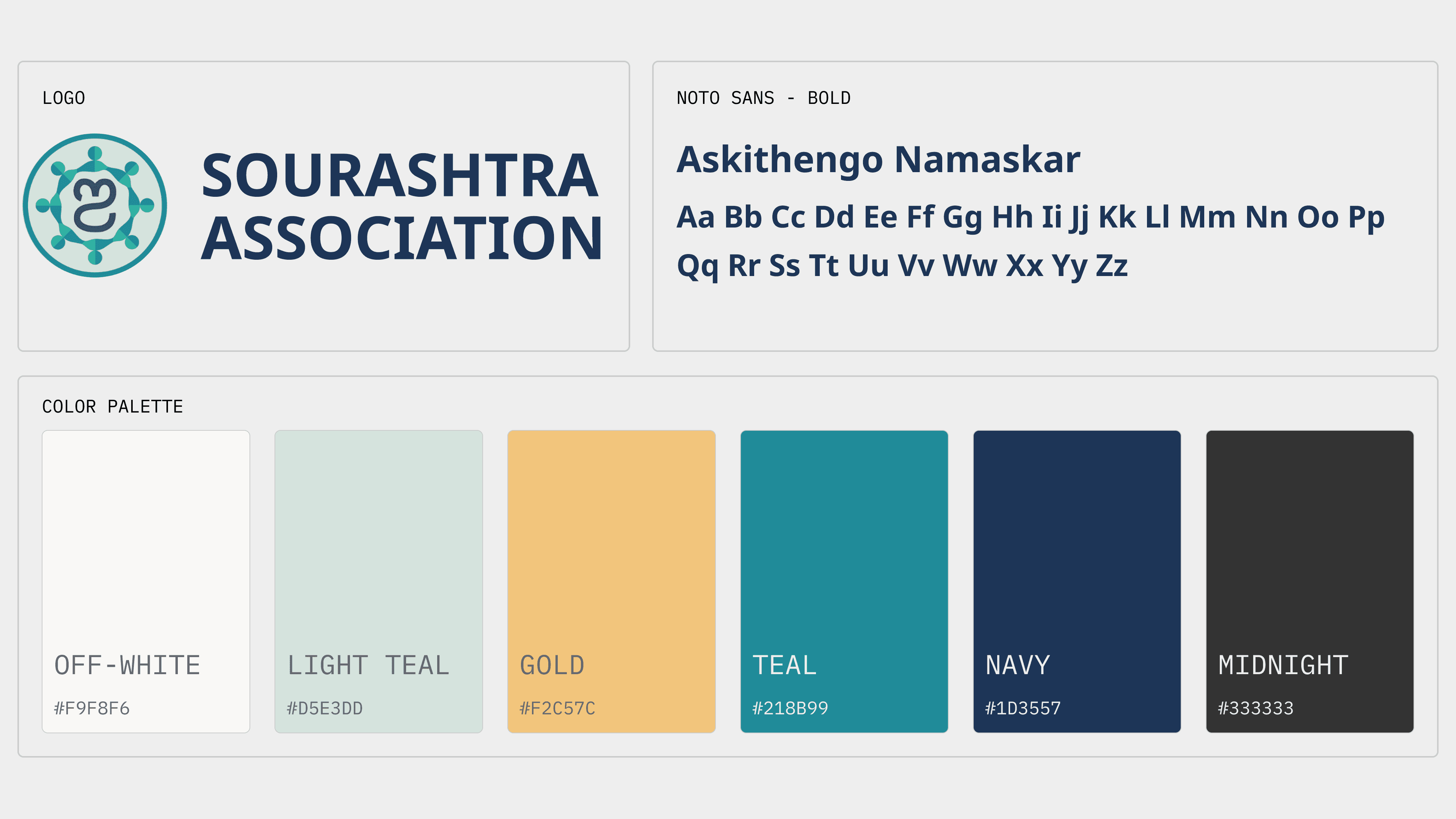
With only 2 months to present our redesign pitch, we made a strategic choice: keep the existing colors and fonts. We didn't do this to be safe; we did it to focus stakeholder attention. By maintaining visual familiarity, we could have meaningful conversations about information architecture and navigation without getting sidetracked by debates about whether the blue should be lighter or darker. The structure was the real problem; the visuals could evolve later.
REVEAL
say hello to the new and improved website!
To bring the redesign to life, we focused on a few key pages that best represented the site’s potential. The homepage, events page, and navigation bar were completely reimagined to show how the new structure, visual system, and design principles could come together. These redesigned pages helped stakeholders see the vision: cleaner navigation, consistent styling, and intentional use of space. Even with just a few redesigned examples, it was clear how much clarity and cohesion the new system would bring.
OUTCOMES
what did the stakeholders think?
The redesigned website was approved by the board and is now moving into development. Because the website isn't live, I unfortunately can't give any metrics; however, the response has been very positive! The board members appreciated how the new structure simplifies updates and makes the site easier to manage, while still keeping the familiar look of the original. For the first time, there’s a shared vision for what the Sourashtra Association’s digital presence can be: clear, cohesive, and built to grow with the community.
REFLECTIONS
what did i learn from this project?
This project taught me a lot about designing within real-world constraints. I had to balance aesthetics with practicality, all while ensuring the site remains familiar to its users. Sometimes the most impactful design work isn’t about reinventing everything; it’s about bringing clarity and care to what’s already there.
Next up, I'll be working on creating templates to make it even easier for volunteers to update and add information to the website.

